COCA COLA BOTTLE DESIGN AWARD 2017
SUMMARY
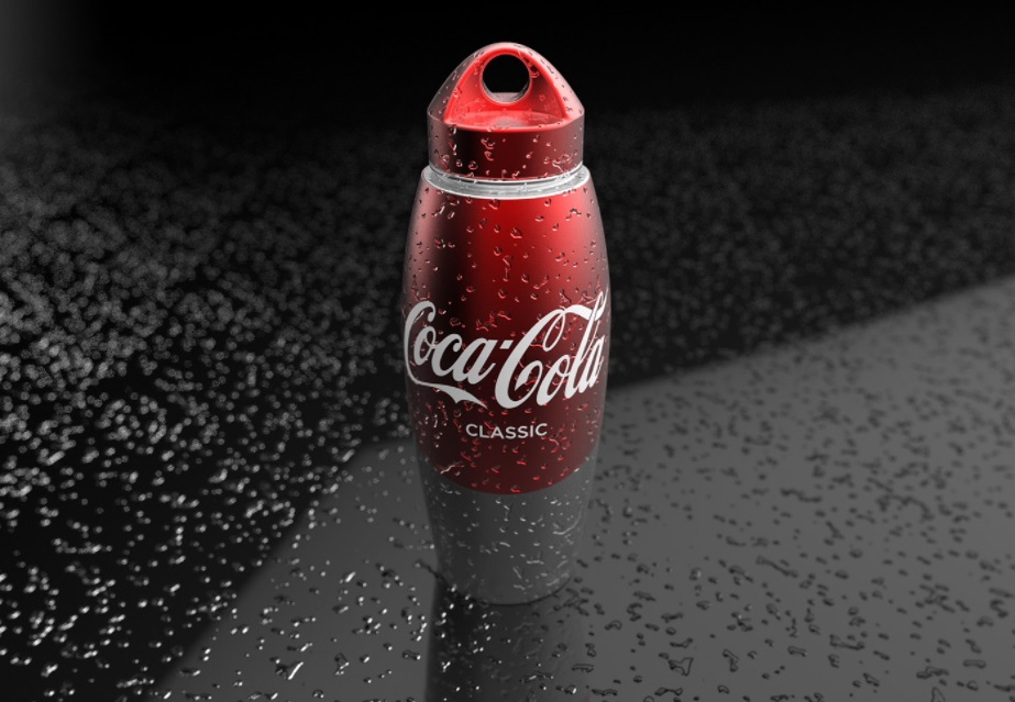
- The design is ideal to acompany trips, since each of the details are designed for easy use, allow to secure grip, practical portability, an abundant drink; And with a distinctive and striking design that makes it a highly attractive product
DESCRIPTION
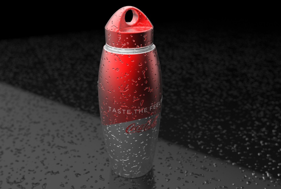
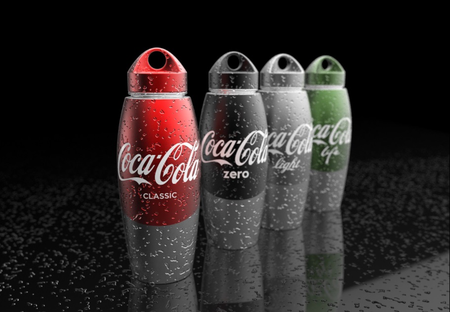
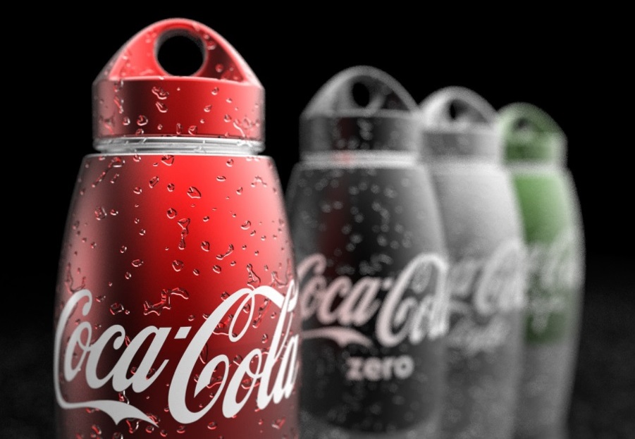
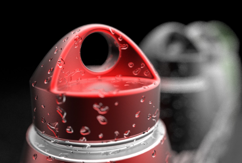
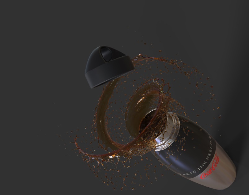
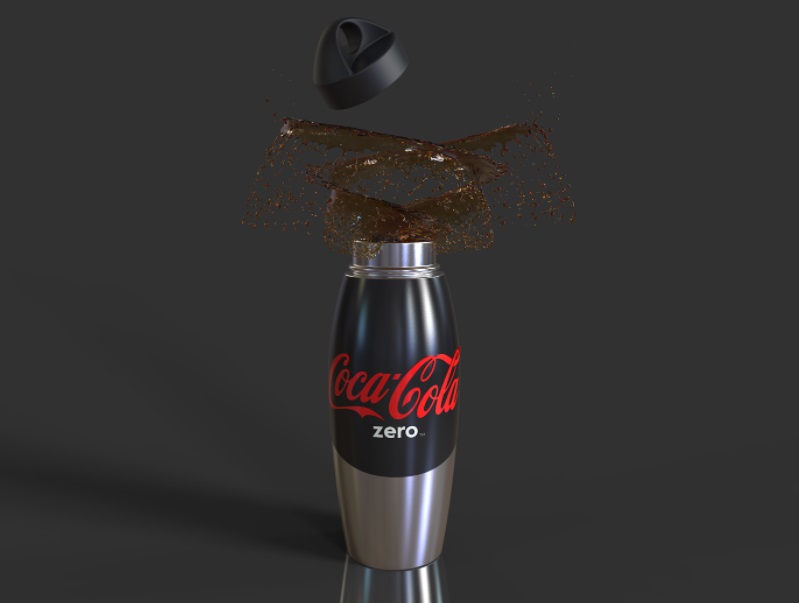
- The design is thought to provide a good accompaniment to your users; it is practical, light, safe and intuitive following a minimalist trend in its composition. the geometry and graphic of the bottle needs few elements that allow a fast reading and impressive for posses a wide area of color applied according to the variety of the drink (Classic, Light, Zaero, Life), giving a unity effect due to the continuity of color between both elements; On the other hand, the Coca-Cola logo reaches on a wide display by its size, horizontal arragement in the wider area and being on a background of high contrast; Allowing users to esaily identify the brand and its varieties, allowing the moment for a fast purchase, the clear communication of the product that helps to make a prompt decision; For this also influences the perception of quality provided by its materials (aluminium and polypropylene) that allow the reuse of the bottle, in addition to its wide opening lid with screw connection system that allows cleaning of the bottle, prolonging the conservation of the product; These differentiating attributes of what is regurlarly handled in the brand,make the bottle is eye-catching and considered as a special edition, collectible product.
- Materials:
- Bottle: aluminium
- Cover: Polypropylene (PP) free of BPA suitable for contact with food.
- MARIO ALBERTO ARIAS VALENCIA
- Industrial designer of Universidad Nacional de Colombia
- Email: maariasv@unal.edu.co
